

The colour of calm
Calming tips brought to you by Cambridge Plantation Shutters.
We have all looked at those magazine filled with amazing homes which are packed with luxury, calm and usually very expensive pieces of furniture and wished that we had the daring, money or taste to copy them into our own houses. Most of the rooms in this glossy ‘home’ magazine exude peace, calm and relaxation and all look as though they have cost a small fortune. Well they need not if we follow a few 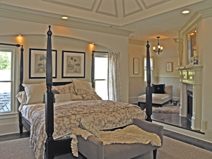 simple rules.
Calm in the home
The key to a calm atmosphere in the home (apart from the people within it!) is colour and storage solutions. For the price of a tin of paint and a couple of storage containers you could transform your living space into a retreat of peace, or you could go all out with a complete makeover and even luxury shutters.
All we now need is a little knowledge on which colours mean what and we are away. Colour therapy is not new, the ancient Egyptians had coloured rooms in their temples for healing and relaxation.
Colour and mood
We all associate different colours with different moods for example we tend to think of sensuality with the colour red and coolness with the colour blue. In her book, The Colour Healing Home (published by Mitchell Beazley, priced £16.99), Catherine Cumming argues that it is possible to lift the 'energy' around us and enhance our spirits simply through a bit of well-considered decoration."
Choosing a colour for your home works on the premise that each colour has its own energy and that we absorb this energy through our light sensitive cells. Of course we all react to colours in different ways and we all have our own personal tastes but there are rules even if they were made for breaking!
The most calming colours are the cool ones which are blues, greens and violets. So we should largely shy away from hot colours such as reds, oranges etc and stick to the cooler side of the colour spectrum. "Violet," explains Cumming, "is a tranquil colour that promotes inspiration and contemplation. Green is a balancing colour, neither hot nor cold, and is particularly effective in the city, where there are few green fields, but blue is the most calming of all. Being in a blue environment makes you breathe out and really slows you down. It is a perfect colour for bedrooms and promotes good, cosy dreams."
Complimentary colours
There are more rules to follow apart from the cool colours we must compliment these colours with splashes of contrast. Violet rooms should have a splash of yellow in the furnishing to compliment the calmness of violet with a splash of intellectually stimulating yellow. A predominantly blue room needs a splash of orange which is the colour of joy and physical activity. We must avoid too much of a good thing for example too much dark blue can have a melancholy effect which is where the expression feeling ‘blue’ comes from. We should also avoid loud patterned wall papers even if they are in the recommended colours and we are told that if we do have patterns they should be soft and imitate shapes found in nature with no hard edges.
Whether we believe in the power of colour or not it never does us any harm to spruce up our living space and enjoy the peace, security and comfort that we find in our own individual homes.
Further articles
We hope you have found this interesting, please see these for more on relaxation: